Inteo Branding

Assisted company CEO and CTO in achieving their vision of a highly usable product with increased student engagement and legibility for e-content based math learning.
Provided critical UI design feedback on entire app platform. Able to reformat the existing designs into a more streamlined user experience for both teacher and student UI. Streamlined the UI from 32 different points of interaction down to 4 clearly defined major user flows with 8 content specific options.
Also created color palettes and designed initial math book UI. Extended project goals included utilizing my extensive print knowledge to update logo and other promotional print materials.

Branding was re-imagined with gamification iconography to increase engagement with younger target demographics.
Inteo Brand Colors
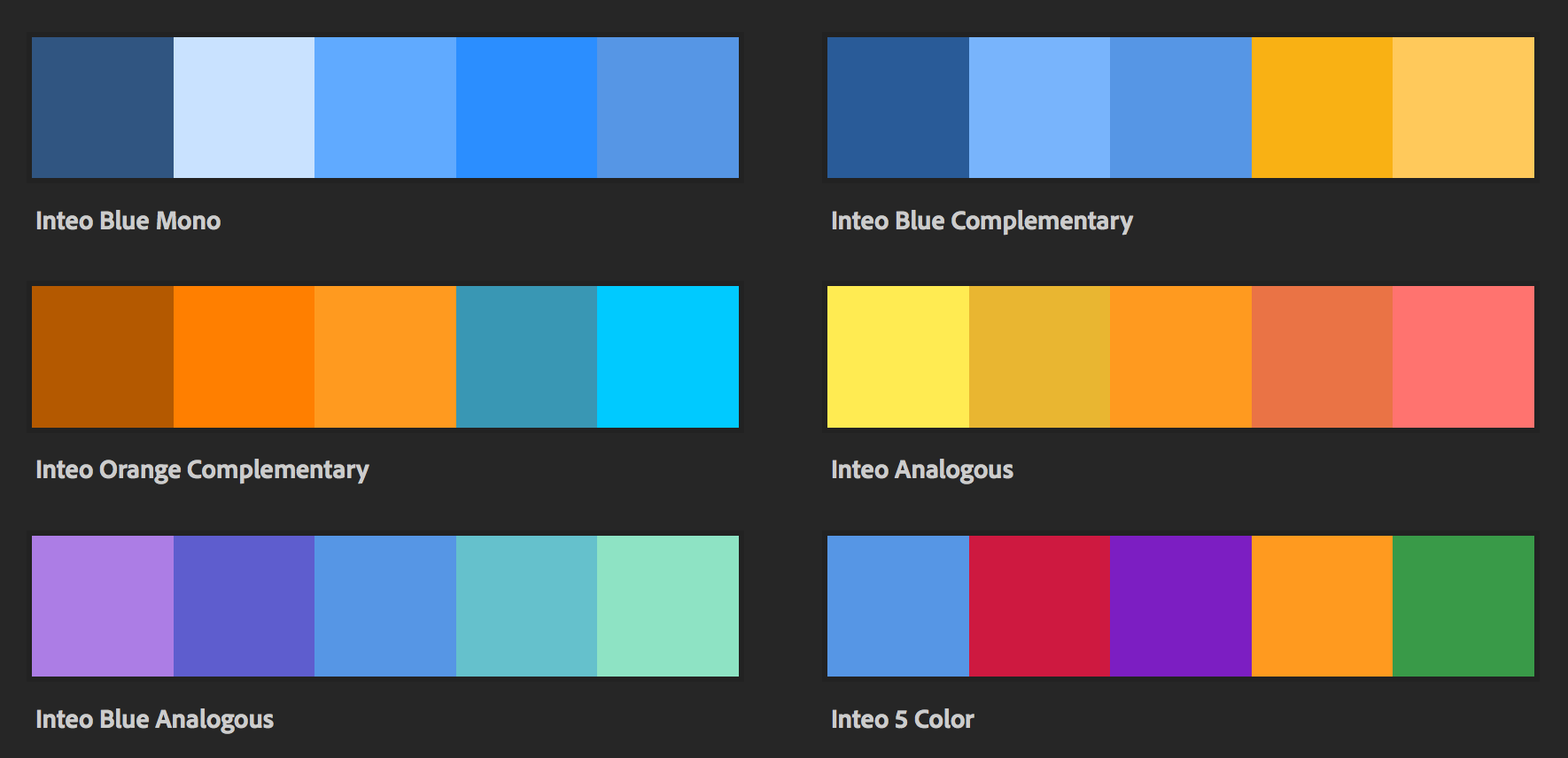
App goal sought to increase appeal of math to middle school and high school age kids through gamification.
Initial color pallets were defined for attention grabbing, highly engaging interfaces while mainlining focus on making math app more exciting visually for school aged children.
Initial Student UI
CEO requested a new, condensed and more intuitive UI experience. Initial UI was similar to Excel toolbars with all options enabled and available, leading to visual clutter.
The original UI reflow was reducing the 32 Interaction points to 8 interaction areas.
Main Menu (TOP): Course Home, Course List, Student Icon, User Settings
Side Bar: Course Dashboard was defined and explored in subsequent steps to encompass all remaining content options and sub-options.
UI layout grid
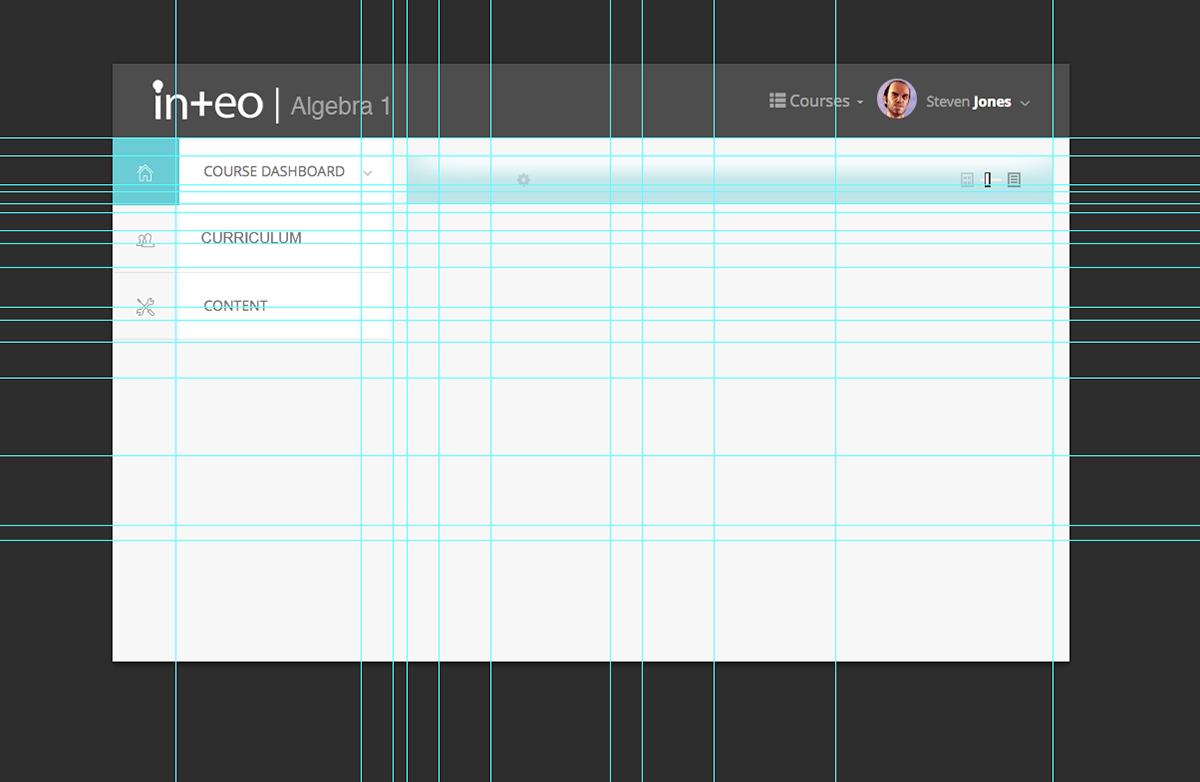
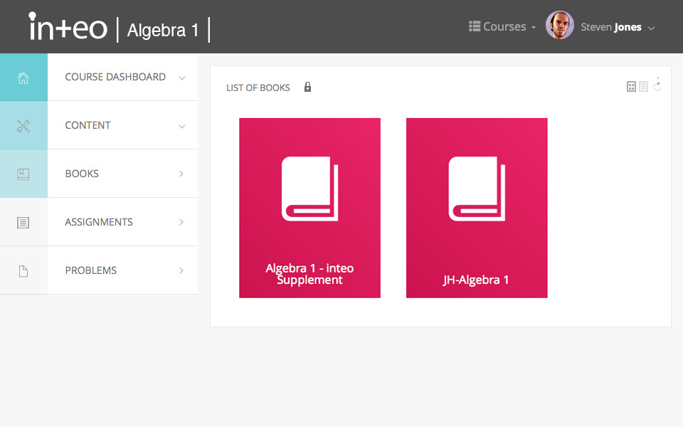
Initial UI Assessment focused on moving to a more intuitive content flow. User area and content menus were clearly defined with stacks of relevant content revealed within expanding accordion menus on the left. Shown below a Course's content is showing the books tab open in the main UI area, while additional course content areas relevant to that module remain easily accessible below the selected tab.
Teacher UI
Exploration during testing resulted in the new teacher UI elements.
Drag and drop tool sets and personally defined UI for both teachers and students was emerged during this phase and explored in subsequent iterations.
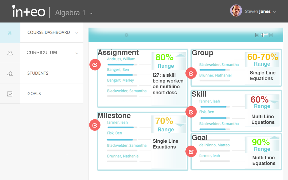
After the Teacher UI assessment we found that this feature scope needed to be deployed across many aspects of the project. A finer ability for users to customize their environment was needed; whether they were are content creator, teacher, or student.I was then tasked to take the test results of the first round, and continue to refine the UI through additional testing.
Our first, full visual concept of these new drag and drop tools and content areas.
Second Draft UI
Drag and Drop Modules
In the continuation of our testing in second UI our original color schemes were deployed across the platform for greater clarity and the workspace was given center stage for more room to deploy the drag and drop modules for both teachers and students.
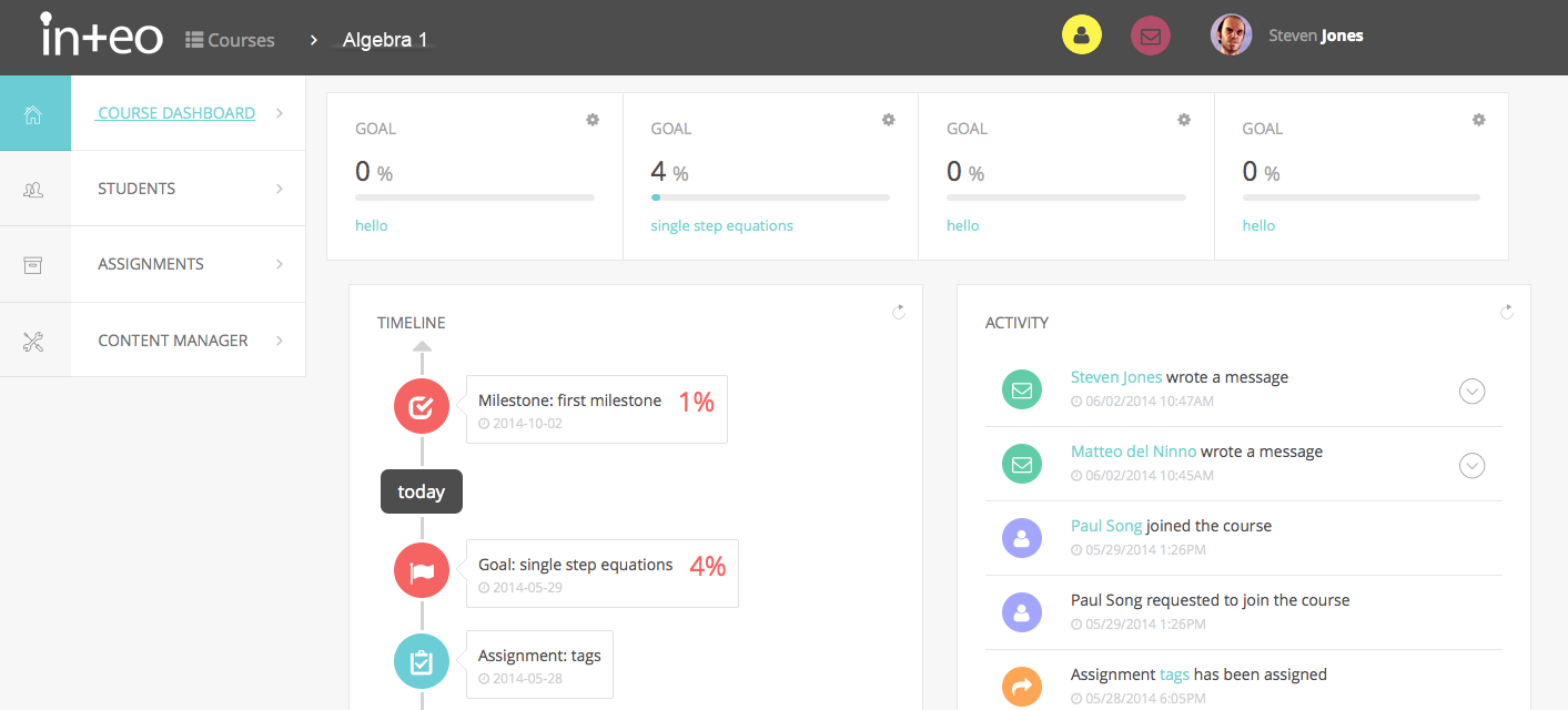
Assignments UI
Related student skill set visualizations and graphing tools were conceptualized an implemented. These tools evaluated the test data on a variety of learning abilities and showcased timings for both students and teachers.
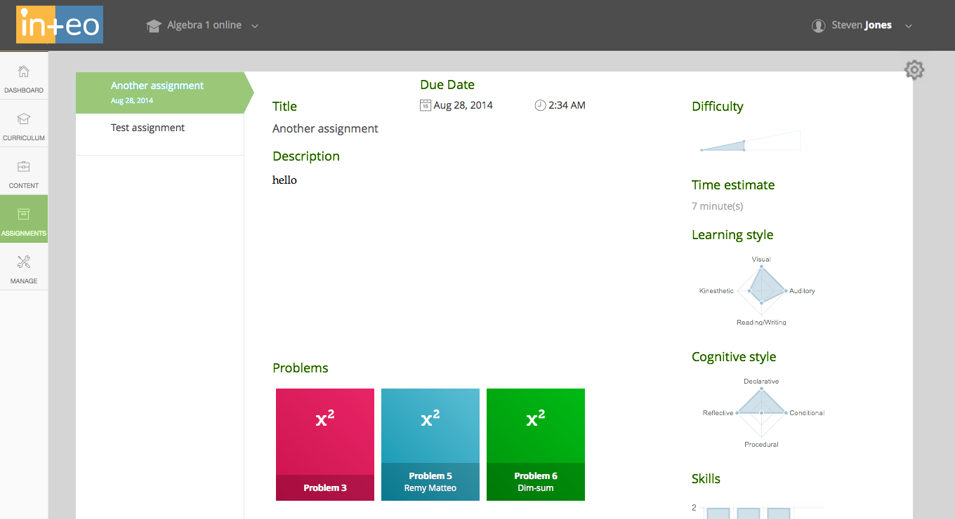
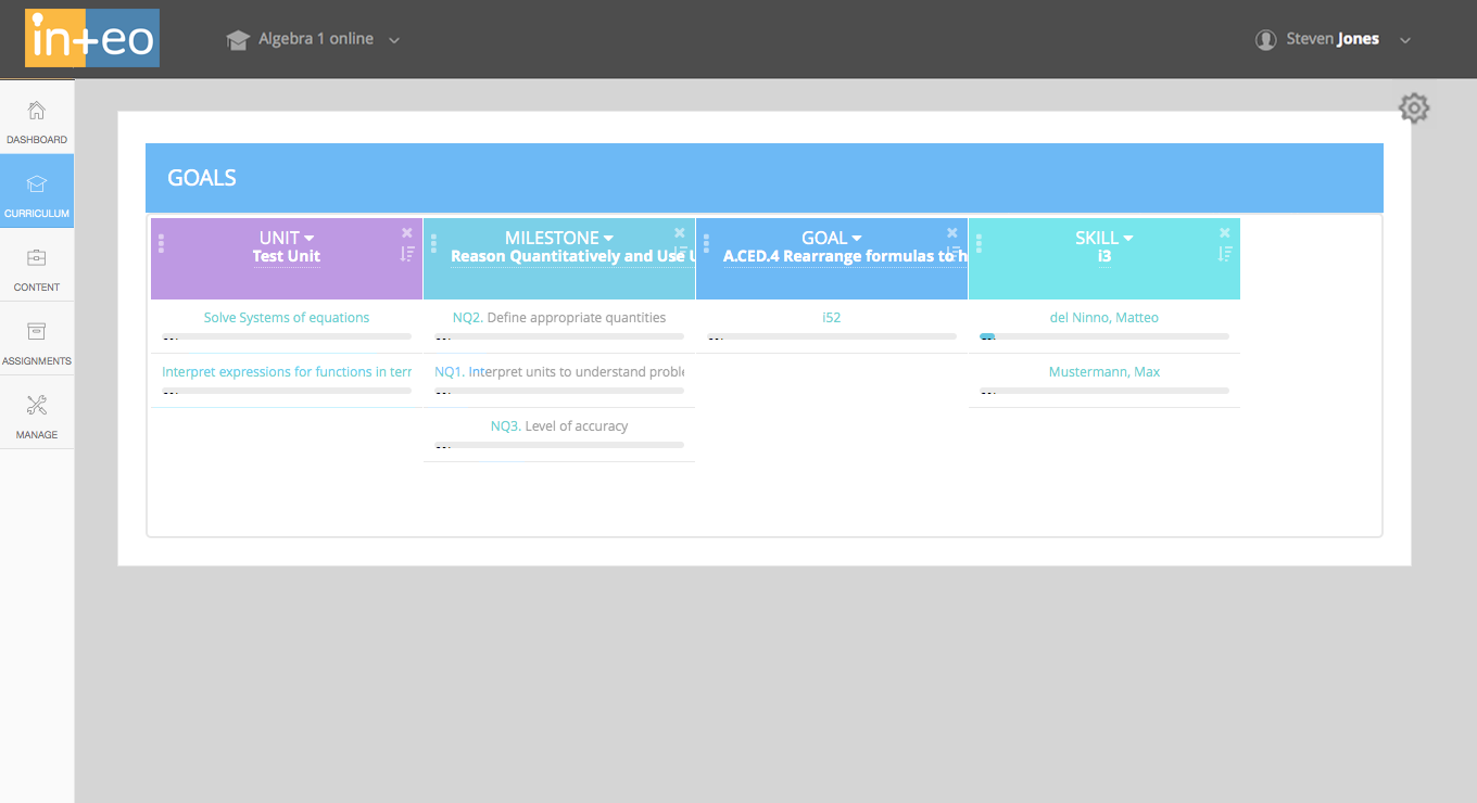
Continuation of the drag and drop tools were explored in the Teacher UI, including more visual tools. Sort functions and drag and drop progress bars were introduced with a variety of categorical and statistical breakdowns. Columns could be defined individually within various ascending and descending sort options for granular or cross sorted results.
Book Content Creator Tools UI
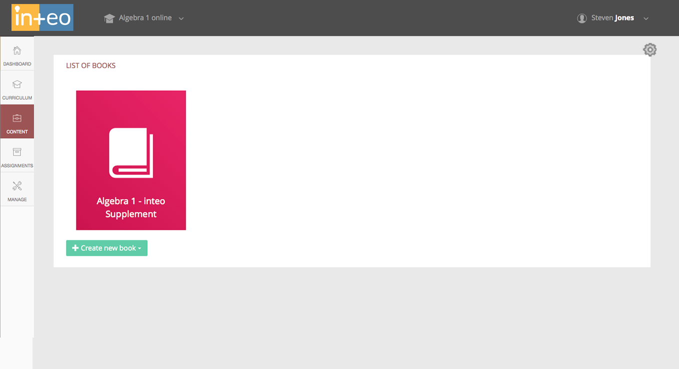
The final UX/UI challenge was in establishing early guidelines for their online books and connected math problems, as the company changed it's focus to College level math and Content Creation. Using my extensive knowledge of print, we moved to convert the traditional text book space into a interactive experience, directly linked to the other tools and assignment data for more accurate ToT assessments.